
What a visitor gets
In the order the product shows it: a featured match, the top tips of the day (only when they pass a strict check), the model's public record, a filterable list of upcoming matches, league matchday pages, and short plain-language answers to the questions a newcomer asks.
The design idea behind all of it is simple. A prediction product is believable only if its interface is honest. So the screens show hits and misses side by side, treat the empty day as a feature, and keep the same structure and numbers in all three languages.
Discover
Problem and users
Who the product is for, and why they would not trust it yet.
Football fans who want a probability rather than a tip have no way to tell which prediction site to trust, so Lens90 makes trust the main feature.
A competitor review on 25 October 2026 found sites in this space with accuracy claims that contradicted each other (78%, 56%, 58% and 9% on different pages), no published track record, and everything framed as tipster advice. Most are English-only. German and Persian speakers follow the same leagues and are rarely served in their own language.
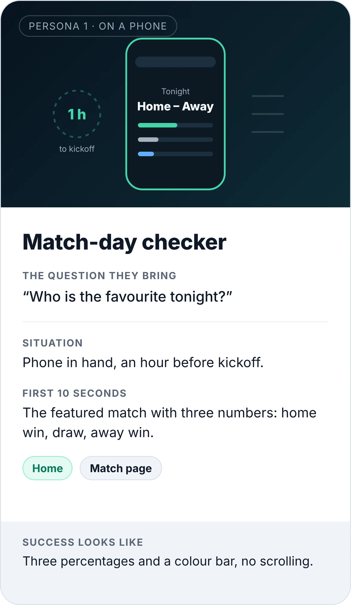
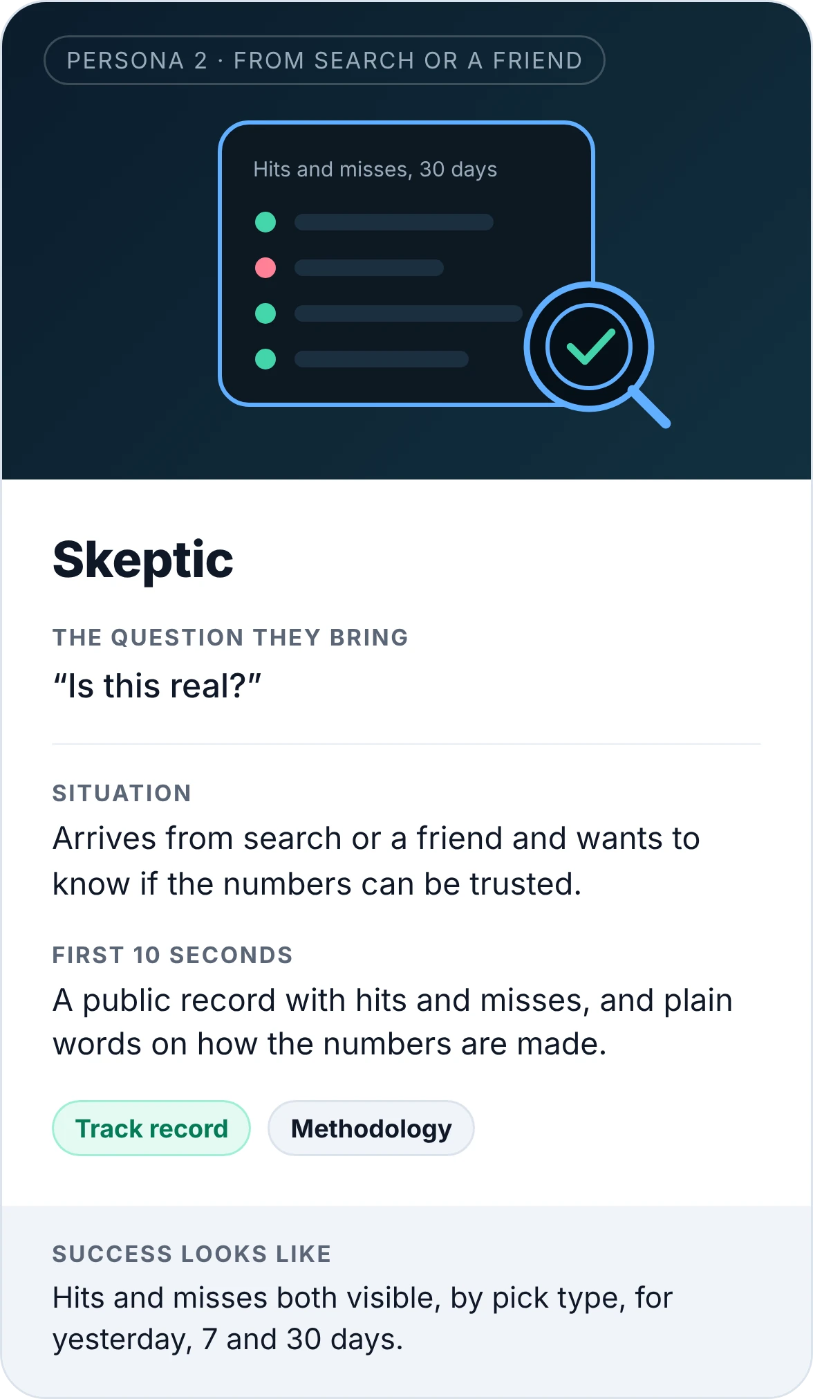
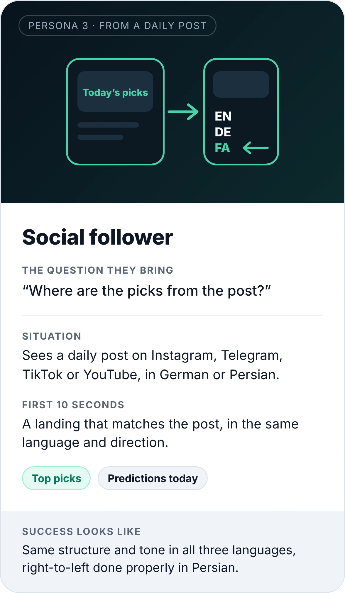
Three personas came out of that, each with one question they bring and ten seconds to get an answer. They are inferred from how the product is built and used, not from interviews. They are a starting point to validate, and the case study says so.
Define
Jobs to be done
What they need to get done, and the paths that get them there.
| Job | When | Where it is solved | Success looks like |
|---|---|---|---|
| See the odds of tonight's match at a glance | Before kickoff | Featured match card, match page | Three percentages and a colour bar, no scrolling |
| Find the few picks worth attention | Morning of match day | Top tips of the day | A short list, or an honest "no picks pass the check" |
| Judge whether the model is any good | First visit, or after a miss | Track record, "The model, on record" block | Hits and misses both visible, by pick type, for yesterday, 7 and 30 days |
| Browse by league or day | Planning the weekend | Upcoming matches with league and date filters, matchday pages | Any league's round on one page |
| Understand what a number means | Whenever a term is unclear | FAQ, methodology, fair odds explainer | An answer in two sentences, in the visitor's language |
| Follow in their own language | Daily | EN, DE, FA versions, social channels per language | Same structure and tone in all three, right-to-left done properly in Persian |
User journeys
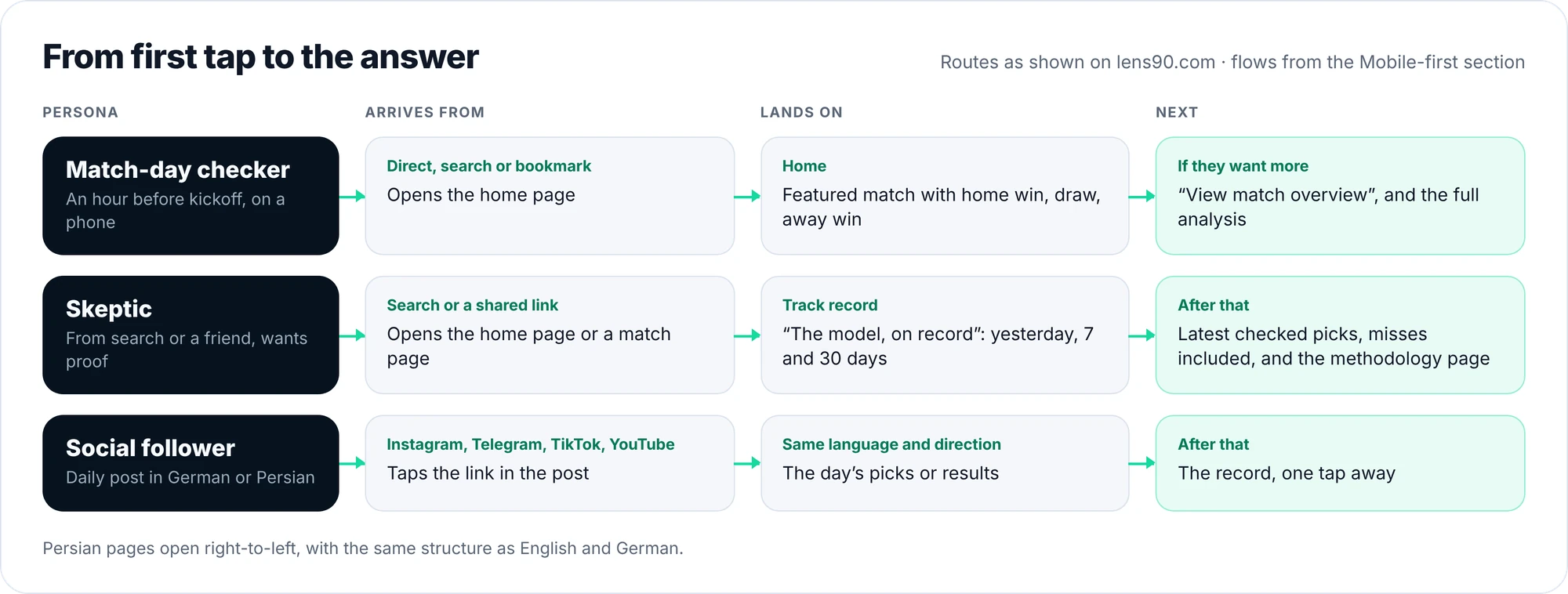
For each persona I mapped where they arrive from, where they should land, and what comes next. The match-day checker lands on the home page and goes on to the match overview if they want more. The skeptic lands on the track record and goes on to the latest checked picks, misses included, and the methodology page. The social follower taps a link in a post and lands on the day's picks or results in the same language and direction, with the record one tap away.
Information architecture
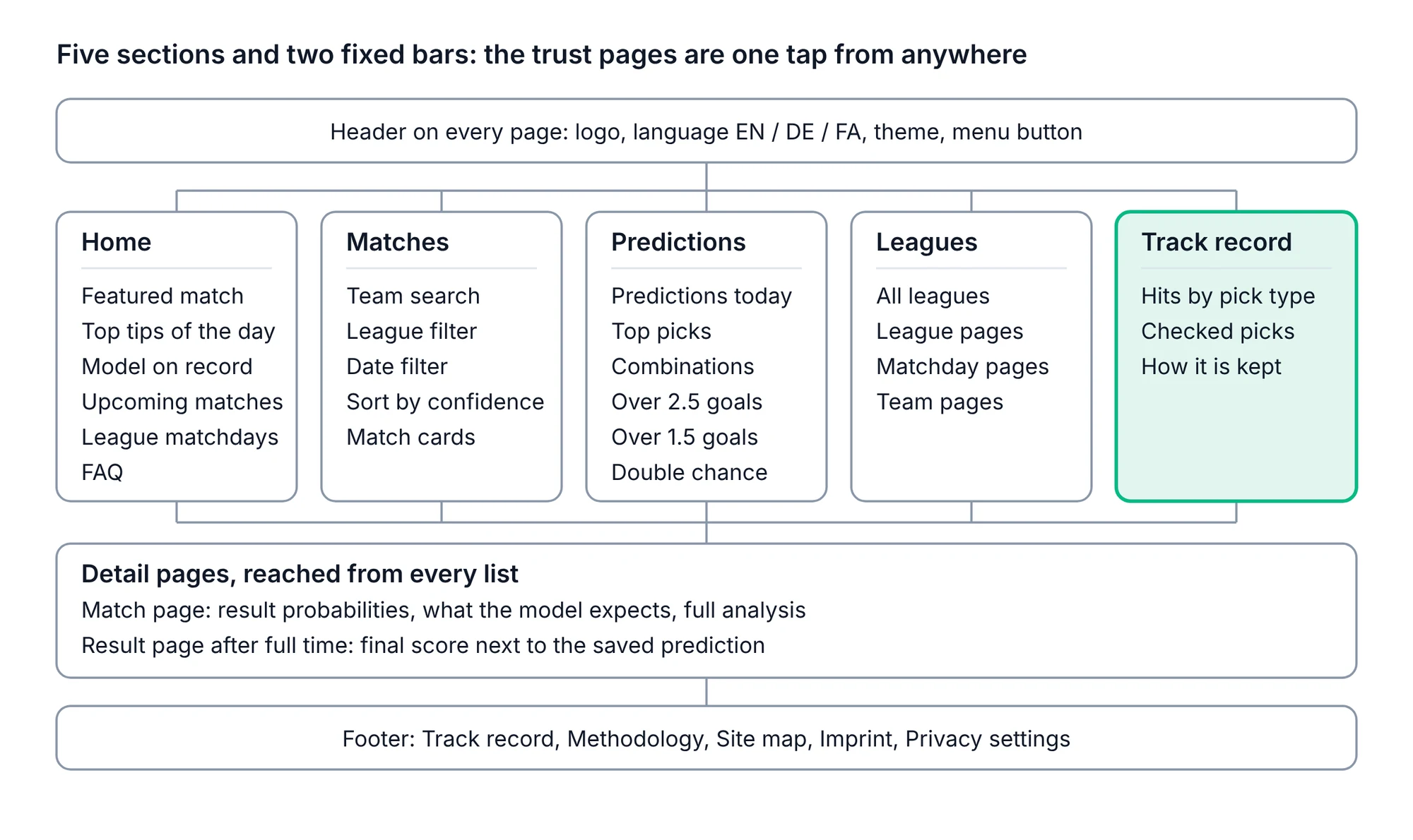
Five sections and two fixed bars: Home, Matches, Predictions, Leagues and Track record, with the header on every page and a footer that repeats the trust pages. Detail pages (match and result) are reached from every list.
The one choice that shaped the map is that the trust pages are never more than a tap away. Track record is its own section and also sits in the footer next to the methodology page, so a visitor who doubts a number can check it from anywhere.
Design
Wireframes, mobile first
Screens, rules and a system that keep the answer in the first ten seconds.
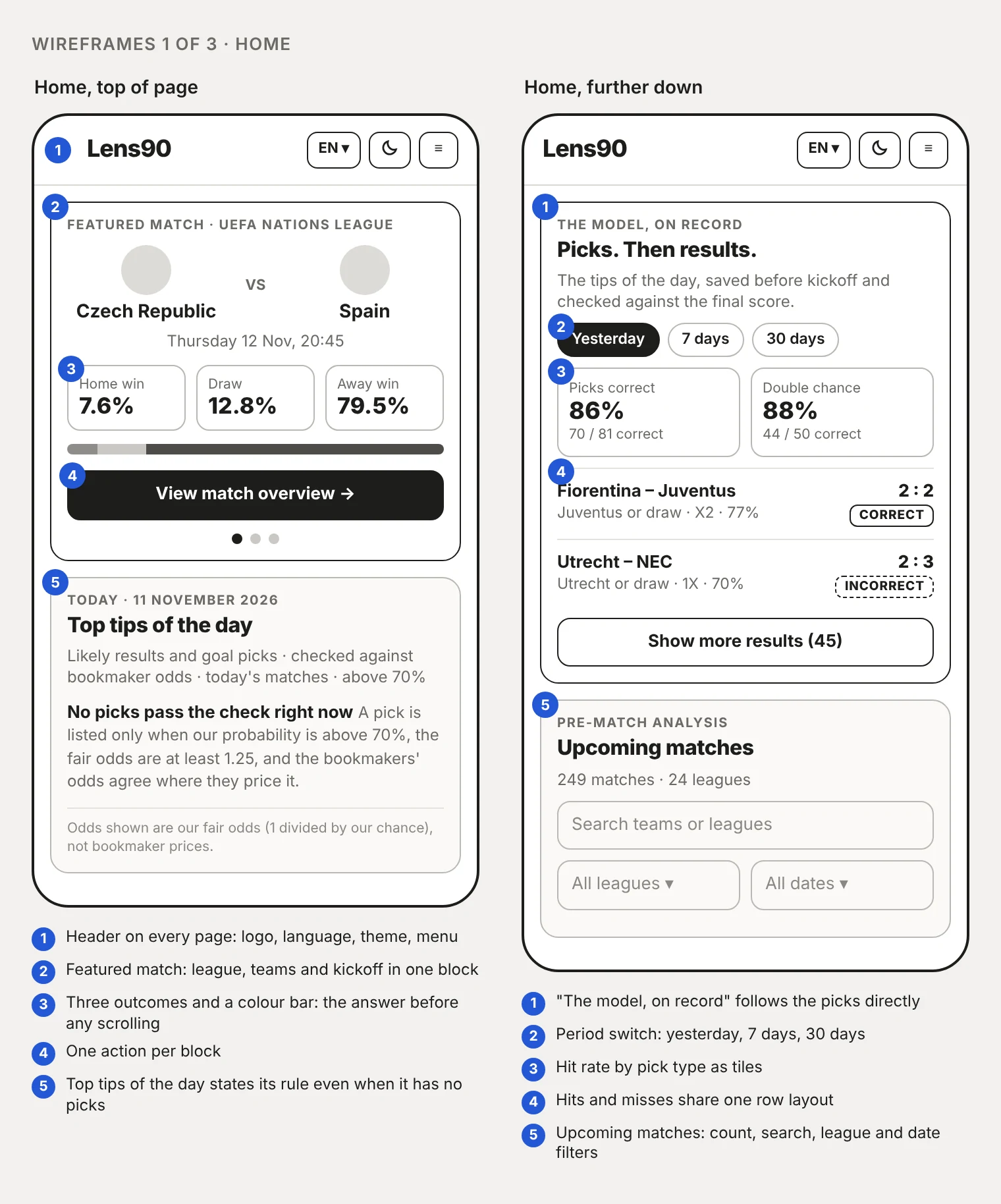
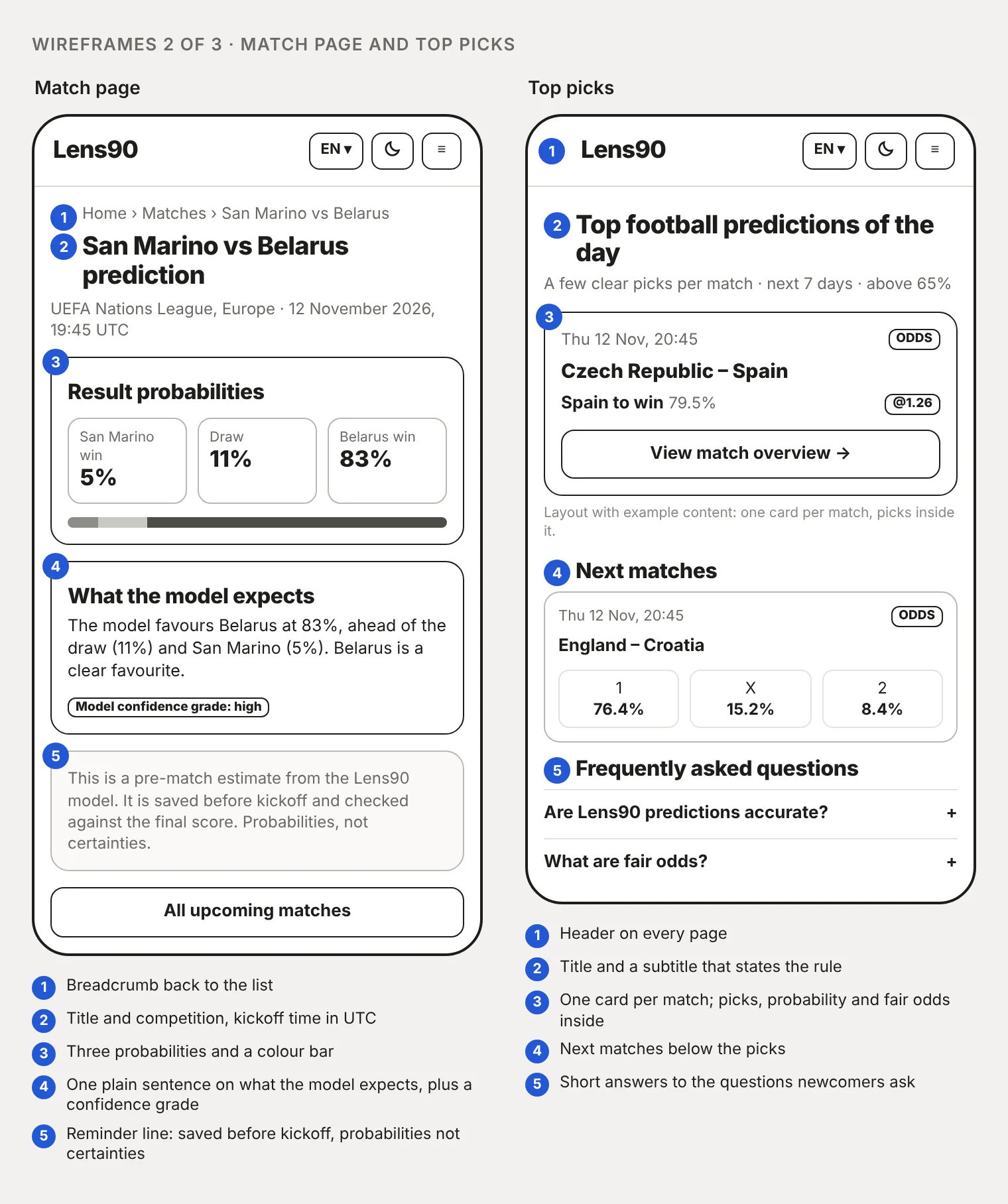
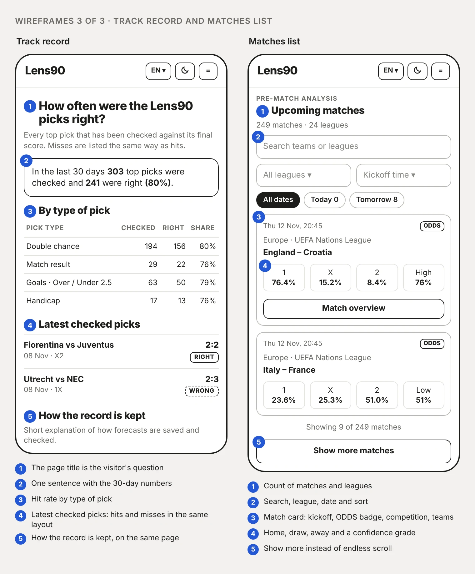
I drew the five key screens as phone layouts first, since the match-day checker has a phone in hand an hour before kickoff. A few rules ran through all of them.
Every block has one action. The answer comes before any scrolling: three outcomes and a colour bar, in the same place on the home page and the match page. The page title on the track record is the visitor's own question, "How often were the Lens90 picks right?", followed by one sentence with the 30-day numbers. Hits and misses share one row layout, so a miss gets no more and no less weight than a hit. Long lists use "Show more" instead of endless scroll, so the footer and the trust pages stay reachable.
Design decisions
Phone first
Mobile first is the biggest design decision. The match-day checker has a phone in hand an hour before kickoff, so every layout starts at phone width (390 px) and desktop comes second. The wireframes here are phone layouts, and layout shift is measured at phone width as well.
Designed states
The empty and uncertain moments are where trust is won, so each one has its own copy and rule. On a day without picks the screen says "No picks pass the check right now" and then states the rule.
No verdicts
Each match gets three outcome cells and a bar. Fair odds are labelled as 1 divided by the chance, and an ODDS badge marks numbers that come from bookmaker prices.
Colour carries meaning
Home, draw and away have their own colours, separate from right and wrong. A green bar for a home win never reads as "correct", and either set can change without touching the other.
A name that cannot be misread
The working name carried the word "bet", which ad networks and payment providers can read as gambling. It became Lens90 on 6 October 2026.
Brand and social
Wordmark in day and night versions, favicon and share image, profile tiles for each language, and templates for the daily social posts. The same saved predictions feed the website, Instagram, Telegram, YouTube and TikTok, so a number never differs between channels.
| State | Where | What the screen says or does |
|---|---|---|
| No picks today | Top tips of the day | "No picks pass the check right now", then the rule: probability above 70%, fair odds at least 1.25, bookmaker odds agree |
| No tips in the next 7 days | Top picks | "No tips above 65% in the next 7 days", with a sentence on when they appear |
| Prediction pending | Match page, match cards | "Prediction not yet available" instead of a number |
| Odds-based numbers | Match cards, match page | An ODDS badge, and the methodology page explains that these competitions use bookmaker prices |
| Confidence | Match cards | A Low, Medium or High grade next to the leading probability |
| Played match | Result and matchday pages | Final score next to the saved prediction, with a right or wrong label |
| Not found | Unknown address | A notice page inside the same shell, with header and footer |
Design system
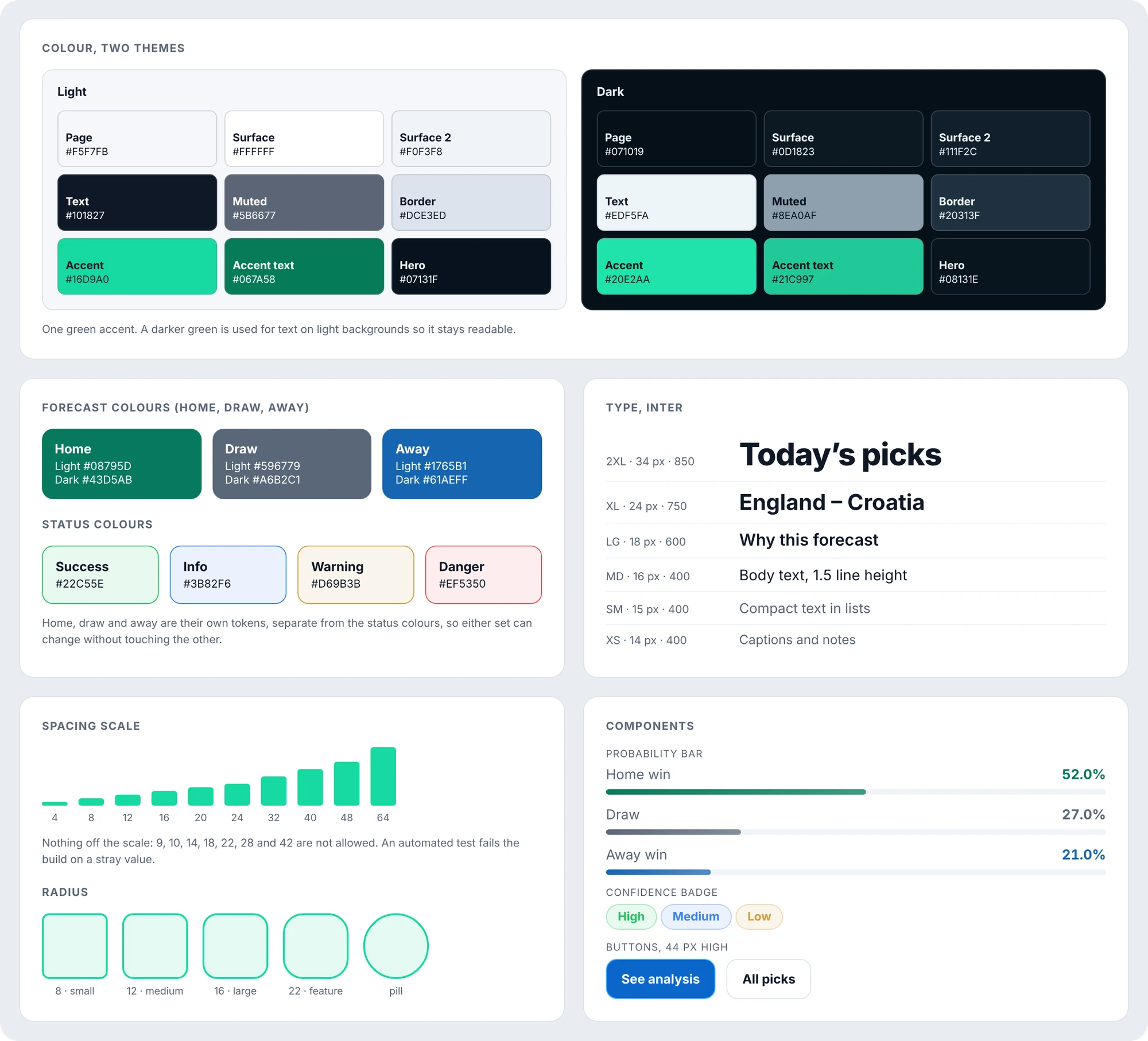
One green accent on a calm grey-blue ground, in a light and a dark theme chosen from the header. A darker green is used for text on light backgrounds so it stays readable. The type is Inter in six sizes from 14 to 34 px, with body at 16 px and a line height of 1.5.
Spacing runs on a scale of 4, 8, 12, 16, 20, 24, 32, 40, 48 and 64 px, and an automated test fails the build on a stray value. A spacing pass on 30 October moved card margins from 10 and 18 px to 12 and 16 px to fit the scale. Buttons are 44 px high.
Three languages, one structure
English, German and Persian pages share routes, blocks and numbers. Persian runs right-to-left throughout, inside a layout that was drawn left-to-right first, so the cards, bars and tables were checked in both directions.
Rojiar, a native German and Persian speaker, reviewed the wording. On 29 October we changed the German "Tipps" to "Prognosen" (Top-Prognosen, Prognosearten, Prognosen für heute), because "Tipps" sounds like a betting tip and the product is not one.
Deliver
The live product
What is live, what the numbers say, and what comes next.
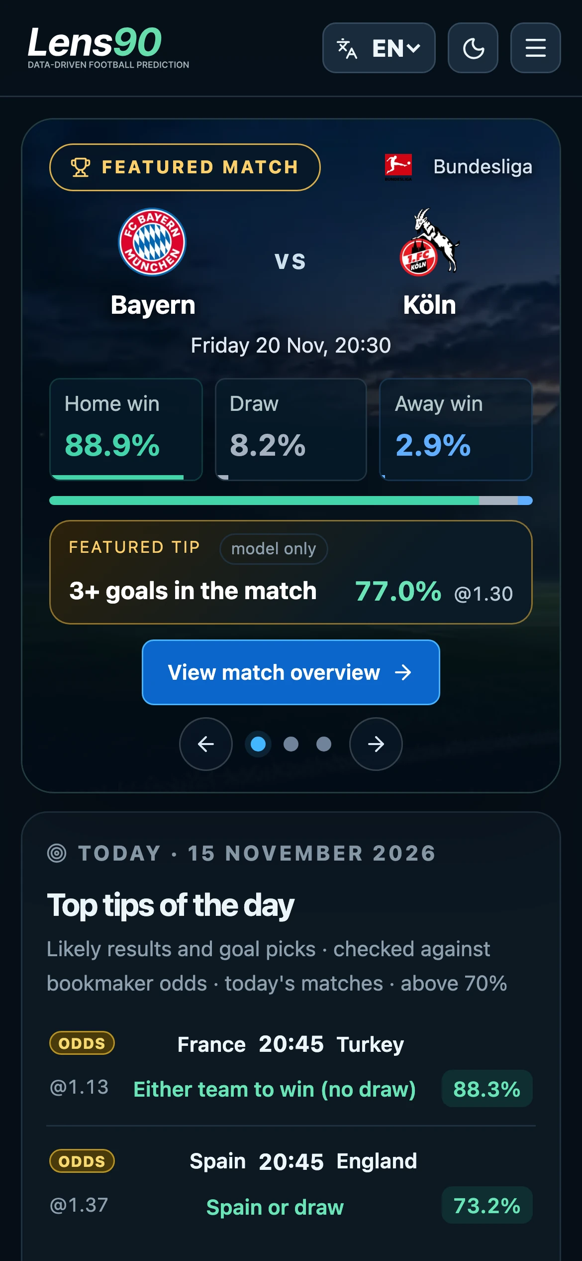
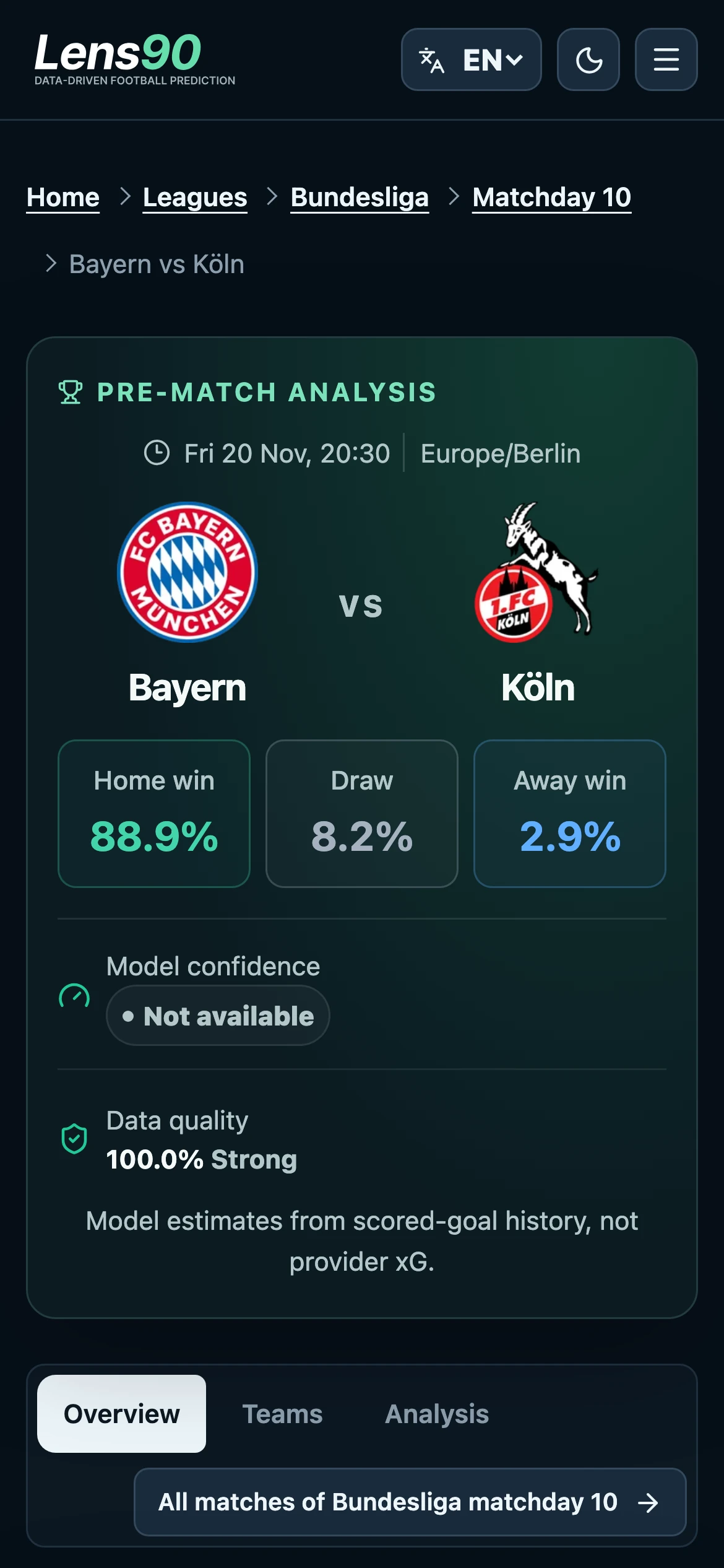
These are the live screens, captured on 15 November 2026 at phone width (390 px), in the dark theme. The home screen leads with the featured match: three probabilities and a colour bar before any scrolling, then the day's top tips with an ODDS badge where a number comes from bookmaker prices.
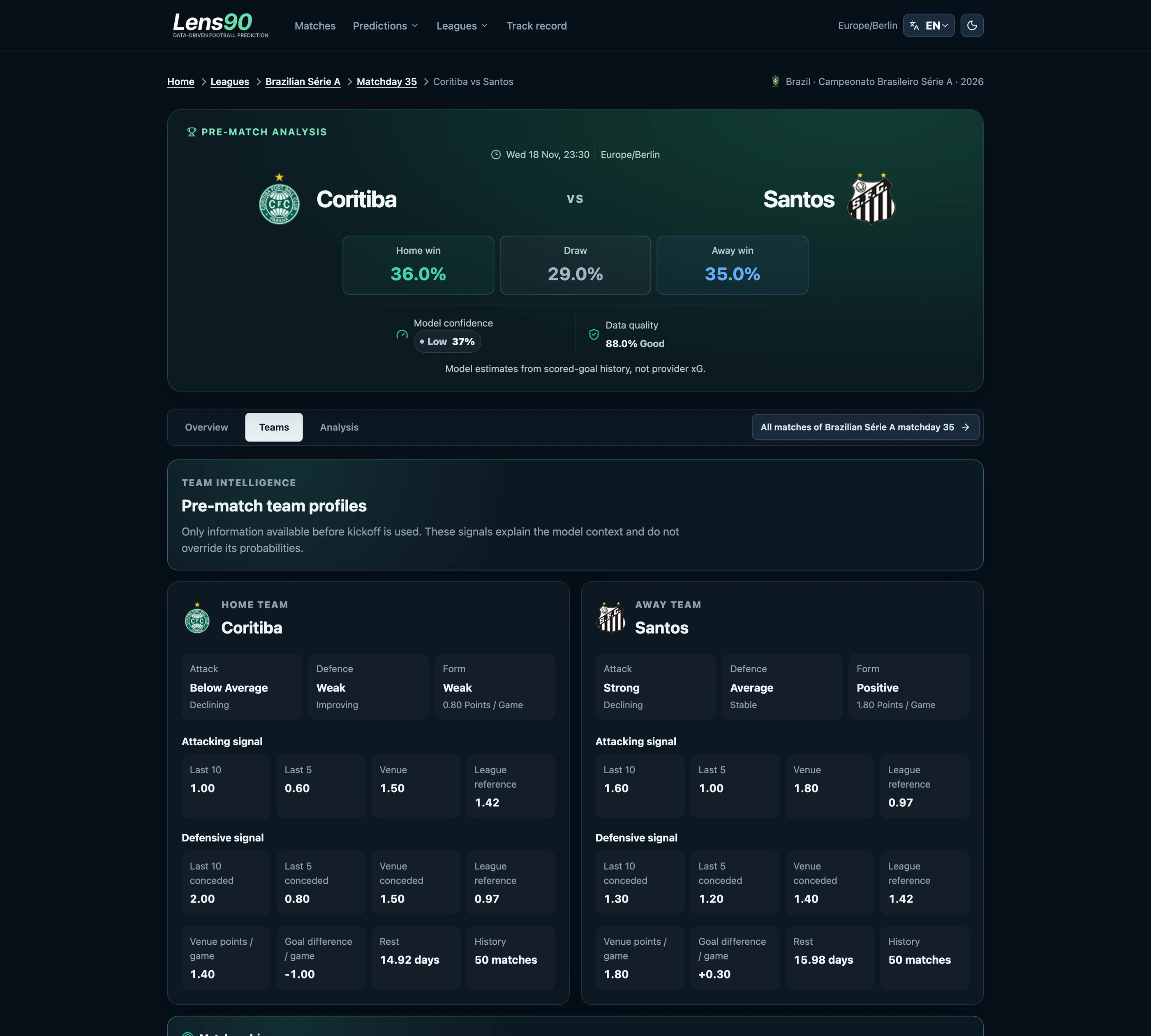
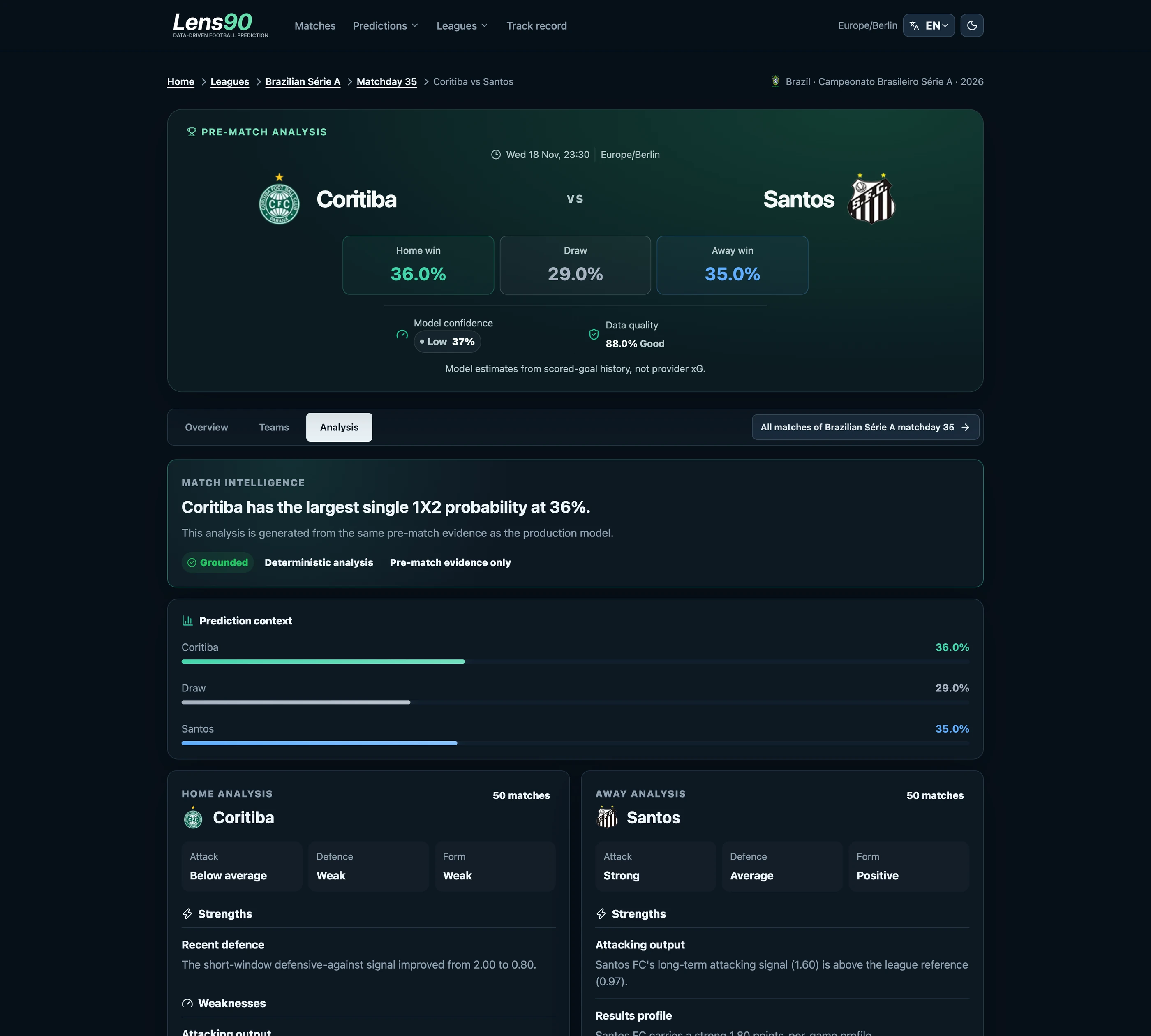
The match page repeats the same three cells and adds the model's confidence and data quality. When confidence is missing it says "Not available" instead of hiding the row.
Then desktop
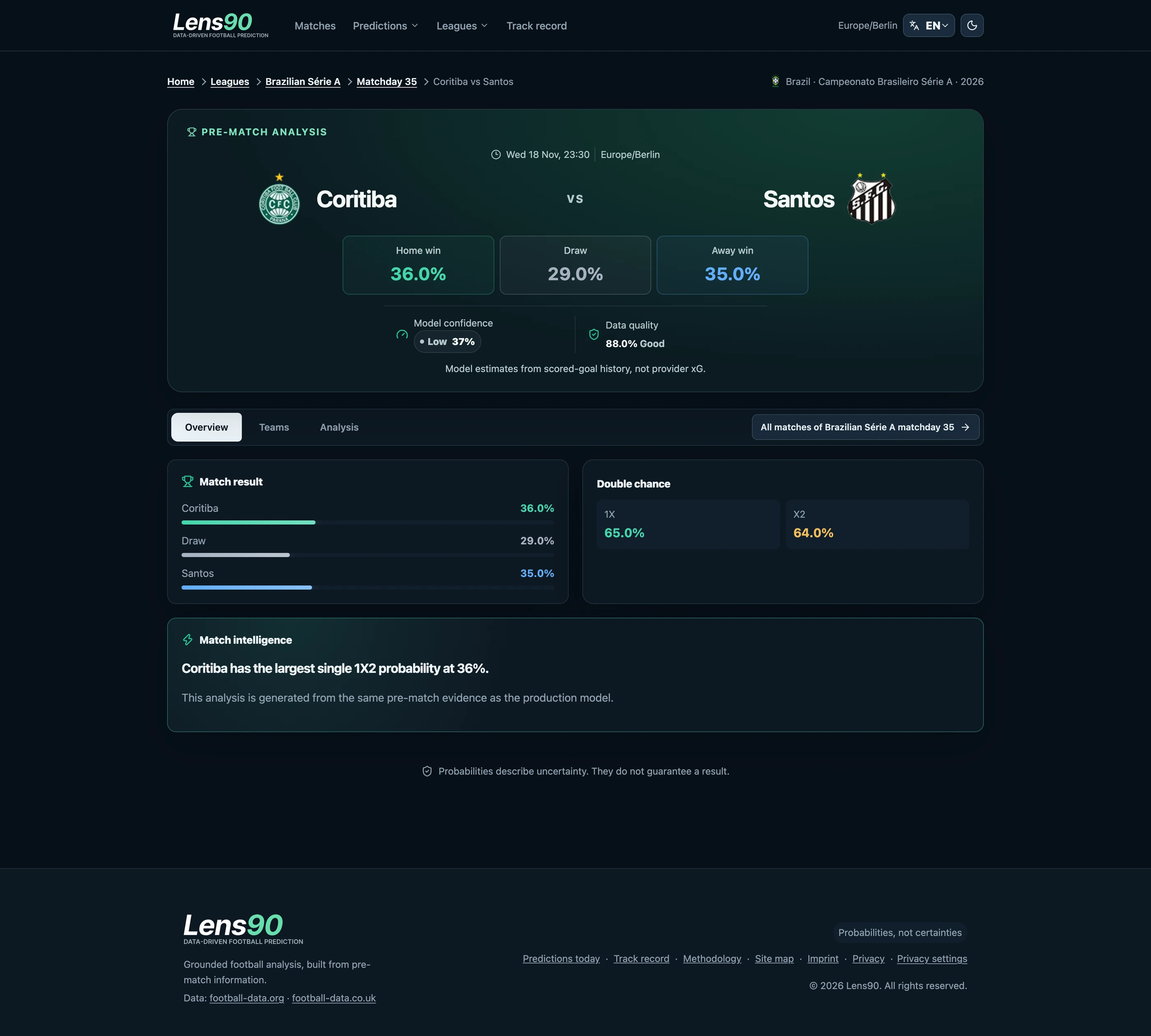
On a wide screen the same blocks sit in rows and the navigation moves into the header. The match page keeps its three tabs: Overview for the result and double chance, Teams for the signals behind each side, and Analysis for the written reasons and the evidence.
Results so far
Lens90 can be defended on process rather than on one result. Every forecast is written down before kickoff, every checked pick is listed, and the interface says plainly when there is nothing to recommend.
On 11 November 2026 the track record page showed 303 top picks checked in the last 30 days, 241 of them right (80%). Picks follow a rule the site states in public: a model probability above 70%, fair odds of at least 1.25, and bookmaker odds that agree where they price the match. Double chance is a low-risk pick type, so 80% does not mean the model predicts matches 80% of the time. It means top picks that passed the rule.
A 30-day window is short, so the figure shows that the method is visible, not that it is proven. On the quality side, a real-browser check on 10 November 2026 measured layout shift at 0.035 on desktop and 0.06 on a phone. The site is early, so there is no traffic figure here to lead with.
| Pick type | Checked | Right | Share |
|---|---|---|---|
| Double chance | 194 | 156 | 80% |
| Match result | 29 | 22 | 76% |
| Goals, over/under 2.5 | 63 | 50 | 79% |
| Handicap | 17 | 13 | 76% |
What I would do next
Validate the personas with real visitors, add more leagues, and make delivery more reliable. Publishing to the social channels needs retries and alerts, because a gap from 12 to 15 November showed what happens without them.